Raghvendra
← All selected work

SaaS Products

Rapipay

A financial super app — payments, banking, and investments in one system

Role
Senior Manager UX
Timeline
Feb 2022 — Apr 2023
Engagement
UX leadership at organisational scale · Employment
Rapipay — A financial super app — payments, banking, and investments in one system

This is the product story. The team and operating model are in Building the NYE design org.

Situation

A consumer trying to spend, move, save, and invest inside NYE had to learn separate product structures for UPI, prepaid cards, partner banking, and investments. The business needed one everyday money app. Internally, each product team used different onboarding patterns, terminology, states, and compliance flows — which increased design duplication and made NYE feel like several products inside one shell.

At a glance

User
Everyday money consumers across wallet, UPI, banking, and investments
Problem
Four product grammars inside one app — duplicated onboarding and trust patterns
My mandate
UX leadership for a shared consumer experience language across squads
Hard decision
Shared grammar with progress-led onboarding over product-line silos or one rigid template
Result
Live product on web and stores; engagement design approach documented in portfolio screens. Less duplicated design remains an intended benefit only.

People affected

Primary users were everyday money consumers on iOS, Android, and web. Stakeholders included product squads for wallet, UPI, banking, and investments; compliance and risk; engineering platforms; and leadership accountable for a single consumer brand.

The apparent problem

Leadership saw a packaging problem: ship more fintech modules into one app shell and call it a super app.

The problem underneath

The organisation lacked a shared experience language. Without common patterns for money states, onboarding recovery, and trust cues, every squad reinvented flows — and compliance reviews multiplied because usability and regulation were negotiated separately each time.

My mandate

I owned
UX leadership for the consumer experience language across wallet, UPI, partner banking, and investments — core journeys, shared patterns, and cross-squad alignment.
Others owned
Product owned roadmap prioritisation per line. Engineering owned platform and payment-rail constraints. Compliance and risk owned regulatory gates (including PCI DSS / ISO framing).
Final decisions
Product leadership made release calls; compliance could block patterns that failed regulatory review.
Team
Senior Manager UX working across multiple product squads rather than a single feature team.
Authority
Organisational UX leadership — set patterns and review journeys for adoption across teams, without owning every squad’s backlog.
Delivery constraints
Live rails (UPI, prepaid/NCMC, partner banking, investments) could not pause while the grammar was rewritten; security and compliance signals had to stay visible at money moments.

Constraints

  • Multiple product teams shipping in parallel with different vocabularies and onboarding states.
  • Regulatory and security requirements that could not be deferred to fine print.
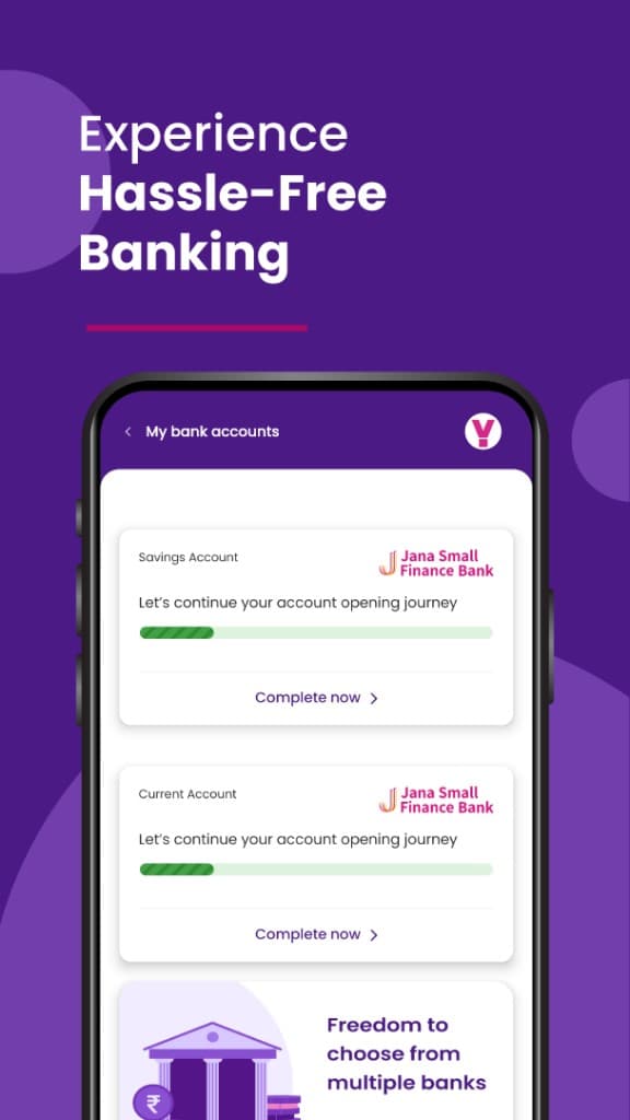
  • Partner banking onboarding (Jana Savings / Current) needed recoverable unfinished states, not dead-end abandonment.
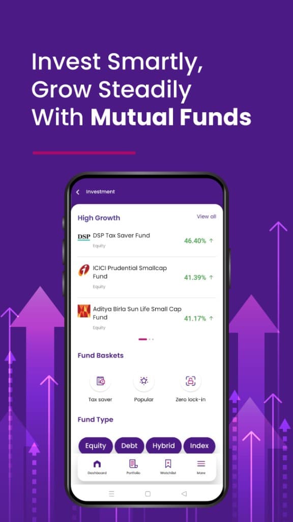
  • Investments (digital gold, mutual fund baskets) had to join the same grammar without feeling like a bolted-on second brand.

Critical decision

Situation

Compliance wanted dense disclosure and hard stops at money moments. Product and UX needed journeys consumers could finish without abandoning account opening or payments.

Options considered

  • Keep product-line-specific patterns and only align visual chrome

    Would preserve duplication: each squad would still invent onboarding, empty states, and trust cues independently.

  • Force a single rigid template for every money moment

    Would fight rail-specific constraints (UPI vs account opening vs investments) and create compliance exceptions that shattered the template anyway.

  • Shared grammar with progress-led onboarding and trust cues at decision points

Observation

Documented research process at Rapipay included collaborative workshops and thematic-analysis boards. Visible board themes explored banking relationship questions — first association, choosing, continuing, leaving, cash management, and opportunities users wished existed — plus assumption/risk framing. Those headers show what was explored; they are not published here as validated research conclusions. Design responses from the engagement are shown in portfolio product screens (progress-led banking onboarding; trust and compliance cues placed at money decisions).

Insight

A shared language slows a single squad’s local invention — but was intended to remove duplicated work and give compliance one pattern to review instead of four.

Response

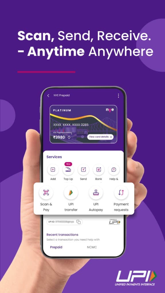
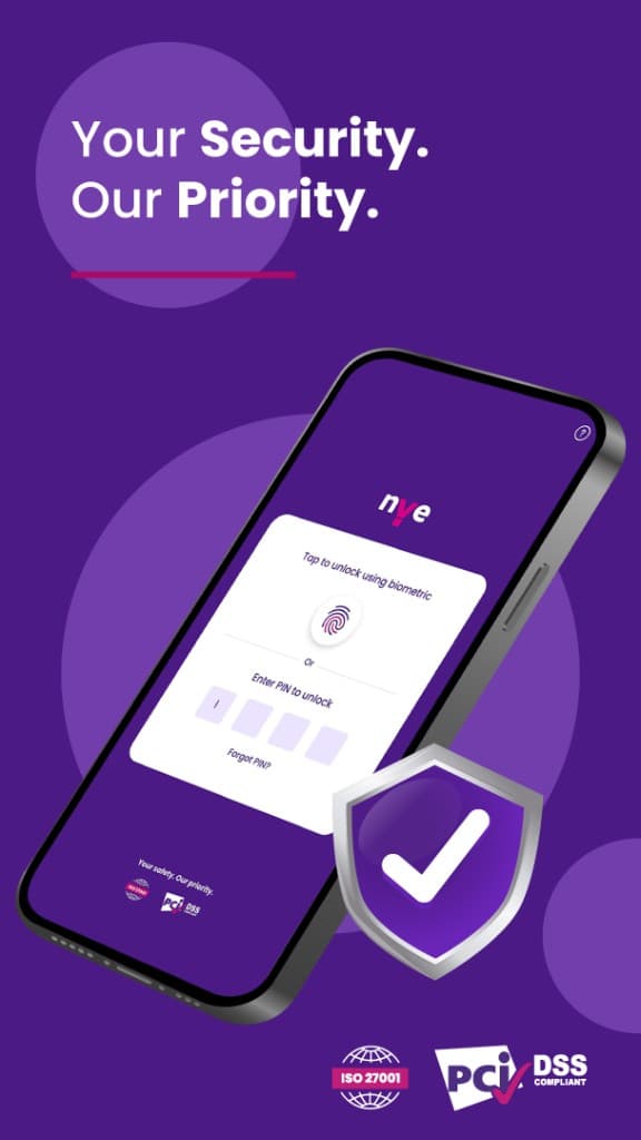
Establish one consumer operating layer — spend, move, save, invest — with progress-led banking onboarding, payment journeys (Scan & Pay, UPI, Autopay, requests) in one mental model, and biometric / PIN / compliance signals held next to the money decision.

Result

Observed: NYE Money is a live Rapipay consumer finance product on web and stores. Portfolio screens from the engagement document the shared-grammar design approach under Senior Manager UX. Intended organisational benefit: less reinvented onboarding and money-state patterns across teams — not documented as an observed reduction, and not a claim about which features remain unchanged on the live product today.

  • Rapipay — after-decision 1
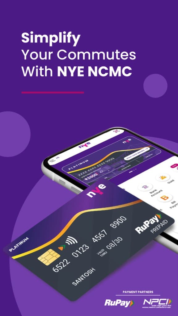
    Marketing landing: live NYE consumer entry. Demonstrates the product exists publicly — not an audit of which current features originated in this engagement.
  • Rapipay — after-decision 2
    Portfolio screen from the engagement: home framed as a money operating layer — spend, move, save, invest — rather than four product hubs.

How the system changed

  1. 01

    Set the experience language and worked it through the product organisation rather than a single squad.

  2. 02

    Framed NYE as an everyday money layer with security and compliance visible in the journey, not only in legal copy.

  3. 03

    Unified payment journeys — Scan & Pay, UPI transfer, Autopay, payment requests — with prepaid and NCMC in the same mental model.

  4. 04

    Structured Jana Savings and Current onboarding as progress-led, recoverable journeys.

  5. 05

    Brought digital gold and mutual fund baskets into the same app grammar so growth products did not read as a second brand.

  • Rapipay — after-system-change 1
    Portfolio screen from the engagement: Scan & Pay / UPI patterns keeping prepaid and request states in one money-movement model.
  • Rapipay — after-system-change 2
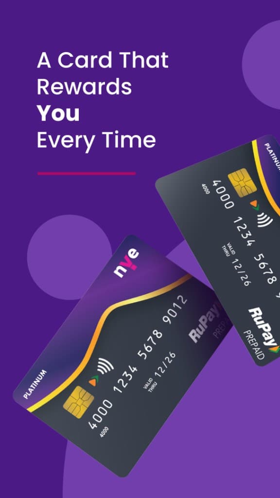
    Portfolio screen from the engagement: prepaid and NCMC held as money instruments, not isolated feature islands.

Validation and iteration

  • Compliance vs. finishable journeys

    Early banking flows treated KYC as a single cliff. Progress-led states were negotiated so unfinished opening stayed recoverable without removing required checks.

  • Investments as grammar, not bolt-on

    First investment surfaces risked looking like a separate product. Shared navigation, states, and trust cues pulled them back into NYE’s money model.

  • Remaining limitation

    A live product demonstrates that the product exists; it does not by itself prove release timing relative to employment or which current features originated in this engagement. Leadership anecdote (starting problem → intervention → observed change) and measured reduction in duplicated design remain unpublished until confirmed.

Outcome

business

Observed: live consumer product

NYE Money is live on web, iOS, and Android as Rapipay’s consumer finance product.

organisational

Documented: engagement design approach

Portfolio screens from the engagement show the shared-grammar approach across wallet, UPI, partner banking, and investments. This documents design direction from the engagement — not an audit of today’s live feature set.

organisational

Intended: less duplicated design work

Shared language was meant to reduce reinvented onboarding and money-state patterns across product teams. No observed reduction is published here.

Product

  • Rapipay — Product 1
    Portfolio screen from the engagement: progress-led account opening so unfinished KYC stays recoverable — compliance kept in the flow.
  • Rapipay — Product 2
    Portfolio screen from the engagement: partner banking language matched to the rest of NYE rather than a bank microsite.
  • Rapipay — Product 3
    Portfolio screen from the engagement: digital gold framed as a money surface in the same grammar.
  • Rapipay — Product 4
    Portfolio screen from the engagement: mutual fund baskets reusing navigation and trust cues from payments and banking.
  • Rapipay — Product 5
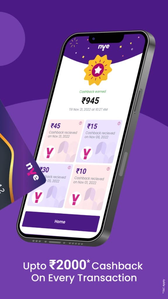
    Portfolio screen from the engagement: biometric unlock, PIN recovery, and compliance signals placed next to money decisions.

Process

  • Rapipay — Process 1
    Loading mark: Y outline motion used while money states resolve.
  • Rapipay — Process 2
    Success confirmation: shared completion cue across money journeys.
  • Rapipay — Process 3
    Medium-fidelity website mockup — early web structure for NYE.
  • Rapipay — Process 4
    Exploratory web concept — testing layout before visual lock.
  • Rapipay — Process 5
    Discovery work: framing the problem space before squads lock patterns into product lines.
  • Rapipay — Process 6
    Weekly planning: keeping cross-squad design work visible and sequenced.
  • Rapipay — Process 7
    Thematic analysis board: theme headers explored for bank-relationship questions — first association, choosing, continuing, leaving, cash management, and opportunities. Headers document exploration scope; sticky-note conclusions are not transcribed as validated findings.
  • Rapipay — Process 8
    Research facilitation: assumption/risk prompts beside the thematic analysis table — framing questions before product decisions.
  • Rapipay — Process 9
    Thematic analysis board kept visible during the research synthesis sessions.
  • Rapipay — Process 10
    Stakeholder discussion: aligning product, compliance, and UX on finishable journeys.
  • Rapipay — Process 11
    UX research workshop at Rapipay: collaborative session on money journeys (RapiPay-branded room).
  • Rapipay — Process 12
    Design room facilitation: shared process visible while the consumer money app was in flight.
  • Rapipay — Process 13
    Process board: design work sequenced and reviewable across the organisation.
  • Rapipay — Process 14
    Operating rhythm: collaboration in situ around the Rapipay design practice.

What I would change now

I would publish a living pattern inventory with owners per squad earlier, and track adoption with concrete examples of retired duplicate flows — so leadership evidence is organisational as well as product-live.

Design system

Rapipay design system — Color
Color

01 / 08

Showreel

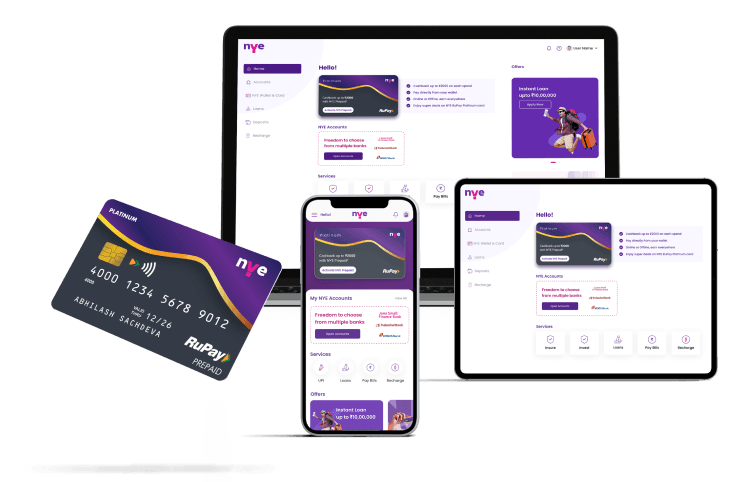
  • Cover page motion — multi-device product surface.
  • Mobile showreel — core money journeys.
  • Mobile showreel — secondary flows and states.

Have a similar challenge?

Work with me.

Start a conversation